Brand Identity and Packaging Design for a Premium Indian Spices Company
Client
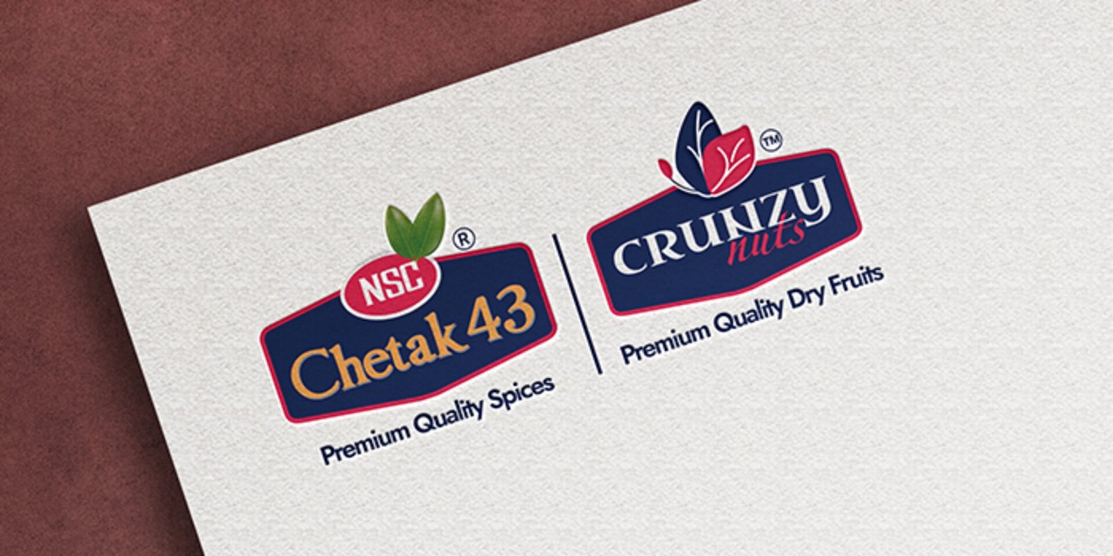
Chetak 43
Industry
FMCG
Location
Navi Mumbai
Brief
A decades-old Indian spices brand was losing ground to modern competitors despite having a loyal customer base. Outdated packaging, inconsistent brand identity, and zero digital presence were the core problems pulling the brand behind. We were brought in to completely reimagine the brand — from logo and packaging to digital touchpoints — giving it the modern, shelf-ready identity it deserved. The transformation helped the brand win stronger distributor trust, better retail placement, and a fresh market positioning that speaks to today’s consumers.
Execution
Starting with a thorough brand audit, we identified the key pain points an aging logo, inconsistent packaging across spice variants, weak shelf visibility, and no cohesive brand system in place.
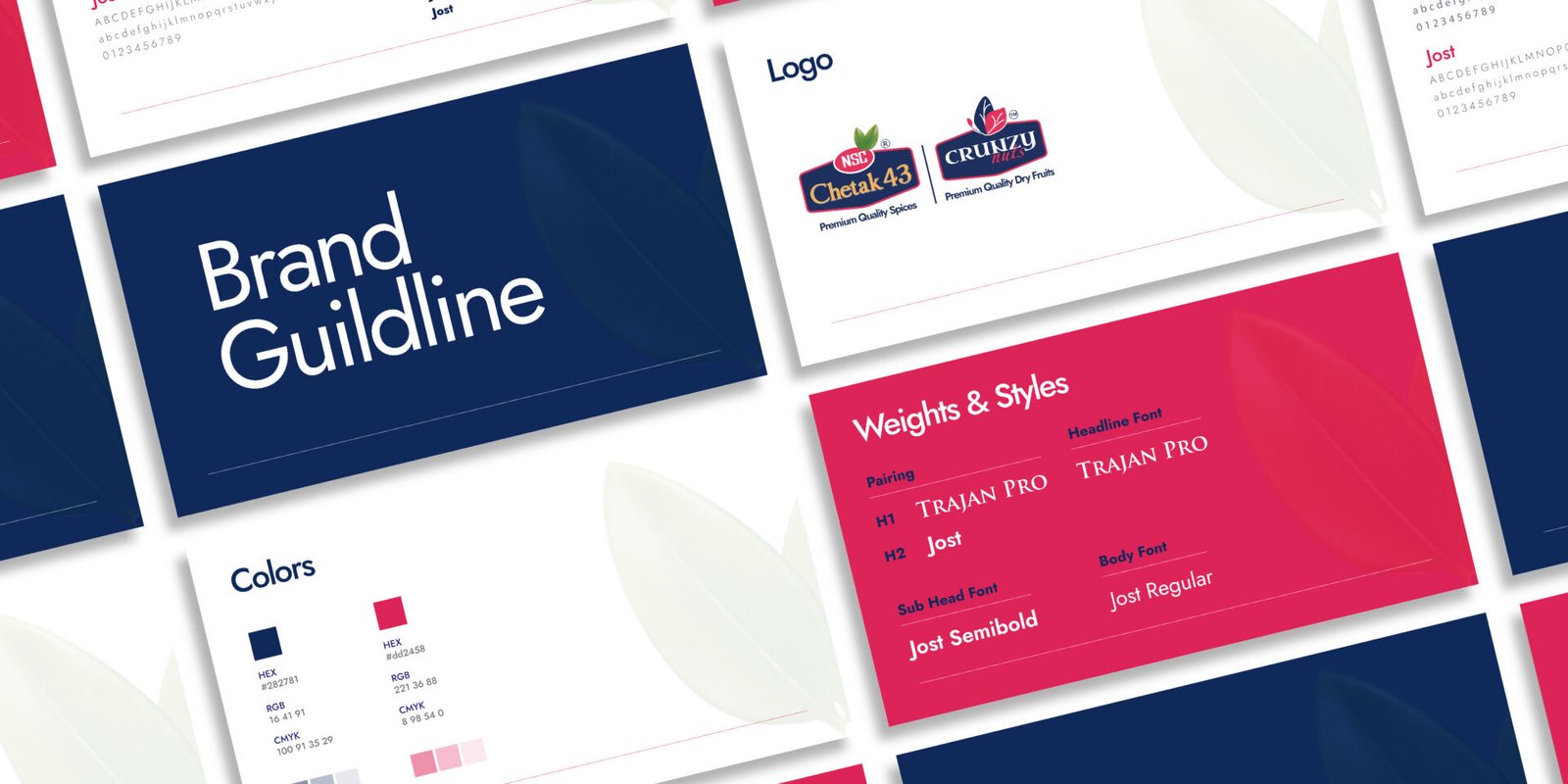
A fresh logo was crafted that honored the brand’s legacy while bringing in a bold, clean, and modern aesthetic suited for competitive retail shelves. Complete brand guidelines were developed covering color palette, typography, visual language, and tone of voice.
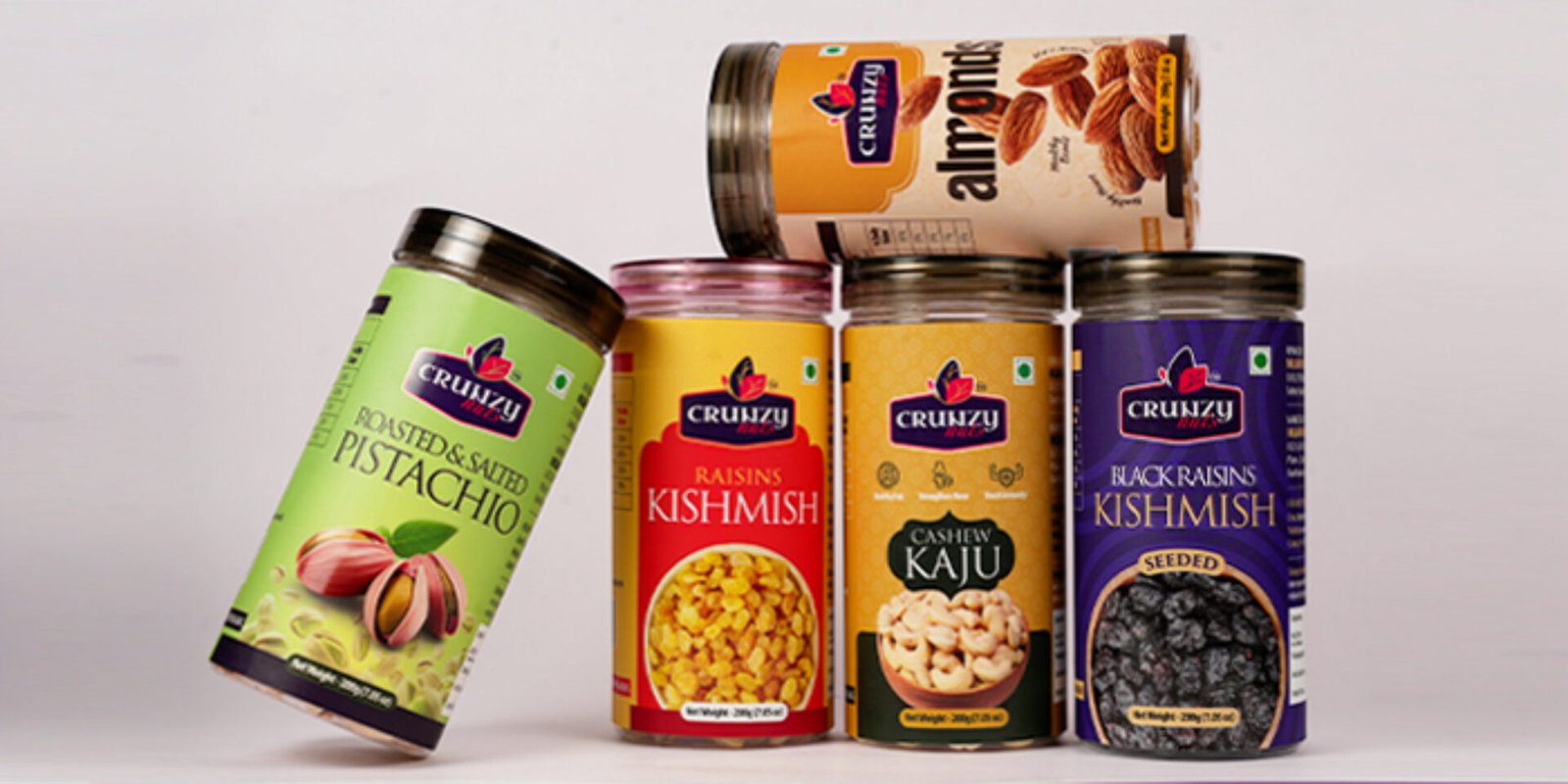
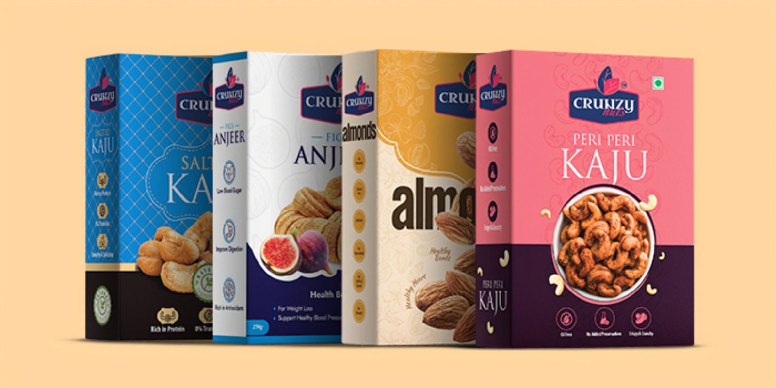
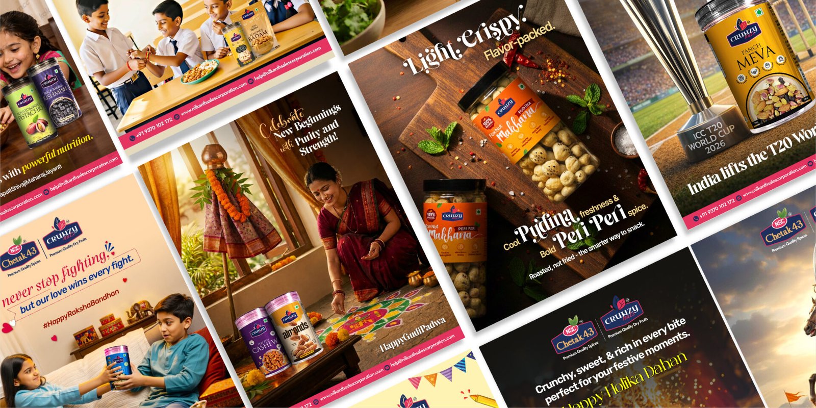
Packaging was redesigned across all spice variants with a strong focus on shelf standout, color coding per variant, appetite appeal, and premium feel. Each SKU was designed to work individually and as a unified product family.
Brand identity was extended across all print collaterals distributor kits, labels, stationery, and marketing materials ensuring consistency at every customer touchpoint.
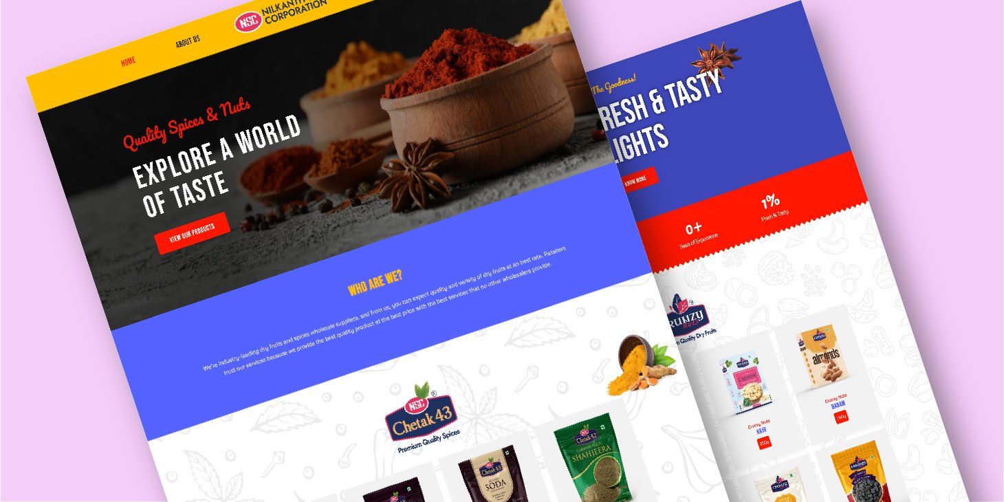
Digital presence was built from scratch including social media design templates, brand story content, and website integration giving the brand a strong, unified voice both on shelf and online.
The final outcome was a complete brand turnaround stronger shelf presence, improved distributor confidence, and a spice brand that now competes confidently in the modern Indian FMCG market.
What all we did?
- Logo Design
- Social Media Posts Design
- Website Development